The People Need a Menu Bar
I like the iPad because I think the idea of a personal computer that is radically simpler than traditional desktop PCs (Macs, PCs, laptops, desktops), but can scale up to more complex workflows, is a good one. But I also agree with the endless tech commentary that Apple has not handled the scaling particularly well, and the apps aren’t there.
Just to give you my example: Microsoft Word. I am a lawyer, and Microsoft Word is not optional. I managed to avoid becoming proficient in Word prior to law school. It’s not just about sending files around–there are certain things that only Word can do. Not Pages, not some bespoke indie app, but specifically Microsoft Word. The only lawyer I know who doesn’t use Word uses LaTeX instead. Nerds, do not try to say that I don’t really need Word.
Well, guess what? A huge number of Word features are missing from the iPad version (as well as the web version, so that’s no fallback). Such as: Watermarks, marking authorities, generating tables of authorities, creating and modifying styles. All stuff which is basically the only reason to use Word. (Of course I don’t use it for actual writing–text editors and Markdown are for writing. The iPad is great for that.) The only way to use the full version of Word from an iPad, if not on it, is to remote over to a “real computer.”
Yes there are people who want to install PyTorch on their iPads, install Linux VMs, and use them as portable podcast recording studios and run XCode. A lot of that stuff would require big changes to iPadOS.
But…making the iPad version of Word have the same feature set as Windows or Mac Word–the same feature set that Windows and Mac Word have had for DECADES–this is not a limitation of the operating system. (The biggest limitation used to be the lack of a standard file picker / “file system,” but the Files app has been around since 2017, and for the basic function of opening and saving files to a folder instead of some custom cloud service or app silo, it’s fine).
No, I think the general limited nature of iPad apps is a limitation of the interaction model. It’s because there are no (system standard and comprehensive) menus.
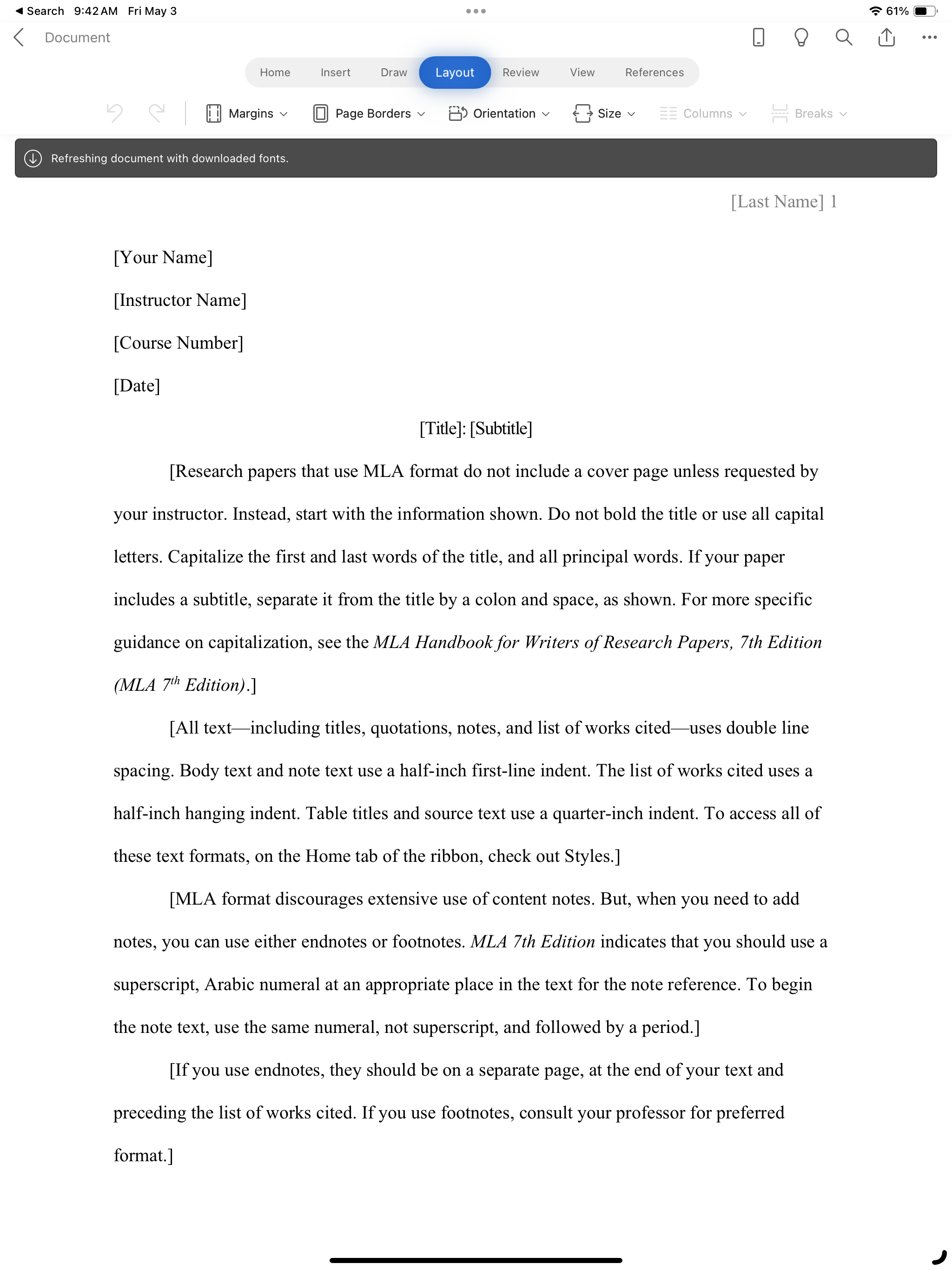 Not a lot of options.
I think the menu bar on the Mac is one of the best pieces of UI ever devised. Usually arguments about the Mac menu bar concern whether it is a good implementation relative to how other GUIs do it. I think the Mac way is better,1 but I want to defend menus in general.
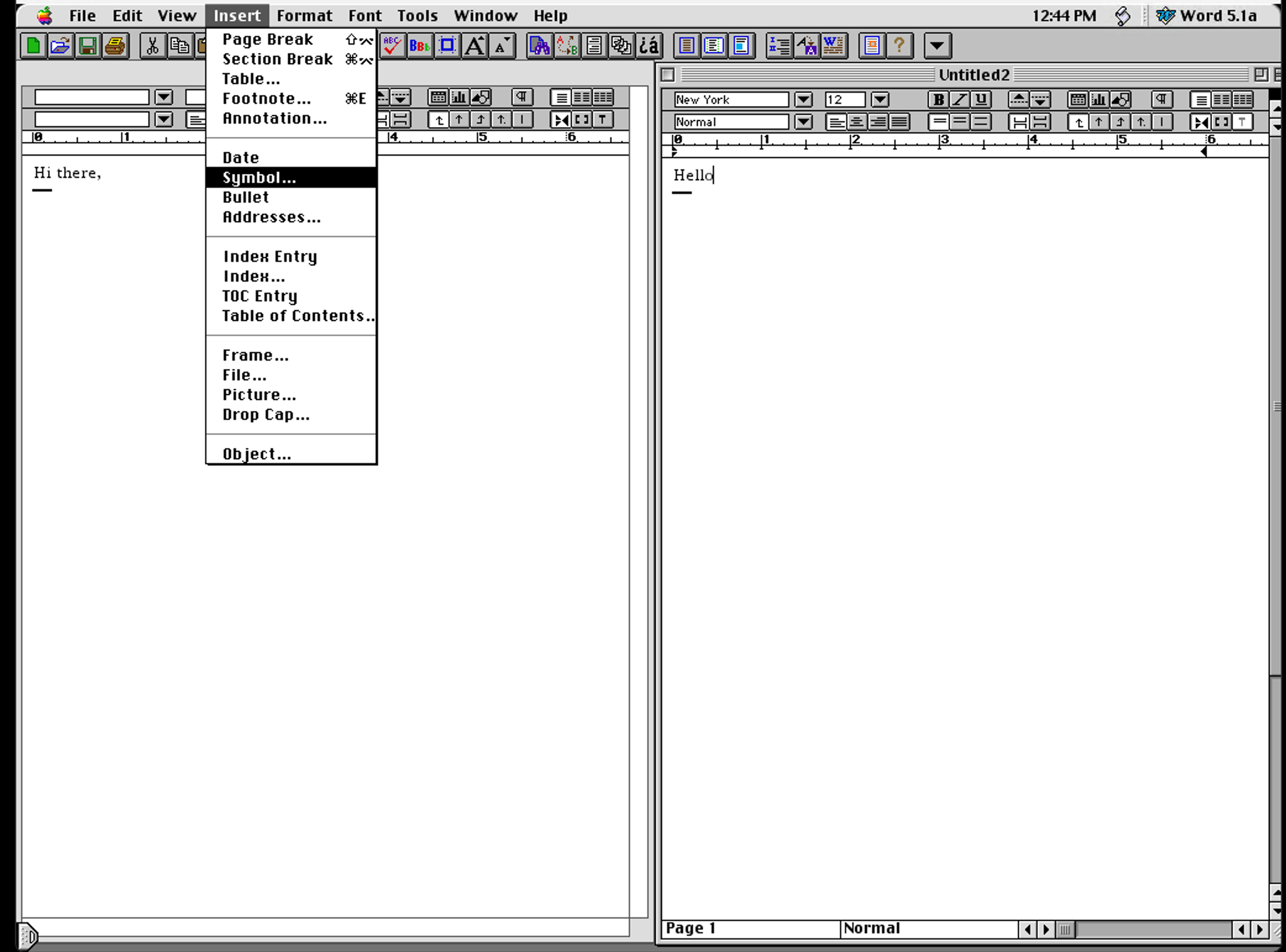 Ah, menus.
Menus, menus, menus. A hierarchical, complete list of stuff your app can do. Menus are the best way to cram a bunch of features into an app without needing to design all kinds of mysterious buttons and chrome for every last app feature. They are better, for example, than an in-app command line, like Autodesk and some Unix text editors have. They are also better than toolbars. Toolbars in general used to be just shortcuts to common functions. But with touch-based apps they’re often all you get. This is fine for mobile apps, since they generally should have more limited functionality. But it is this aspect of the iPad’s lineage–that its apps are descended from phone apps–that holds them back. Since there is no easy way to add the kinds of long tail features that pro apps need, apps either come up with various custom solutions, use semi-standard elements like toolbar icons that have a menu-esque dropdown with more choices, or more commonly, they just leave them out, and create an iPad app that is no more functional than a phone app, just maybe a bit nicer to use.
Menus are great though, and the iPad needs a standard way for them to be incorporated.
You don’t need to waste screen real estate on chrome for little-used features.
Discoverable: You can just browse through the menus to find out what features are available. You can also search through Mac menubar items now, which is a great feature.
Fast: Even forgetting Fitt’s Law, menu items can provide keyboard shortcuts, as well as a standard way to find out what they are.
Easy-to-understand: The only way to figure out what toolbar icons do is to guess, try them and see, or to read the text label, if there is one. But menus are all text label. Words are good!
Microsoft has tried to downplay menu bars in recent years. The result? Well, you might have the MS Office ribbon interface, which is really just a glorified multi-part toolbar. Some problems with this: 1) It’s ugly, 2) It doesn’t work at all with smaller windows–say, a window that was the size of the document you are editing, which doesn’t need to take up the whole screen, and 3) It’s unusable without text labels anyway, so why not just get rid of the dumb icons and bring back menus?
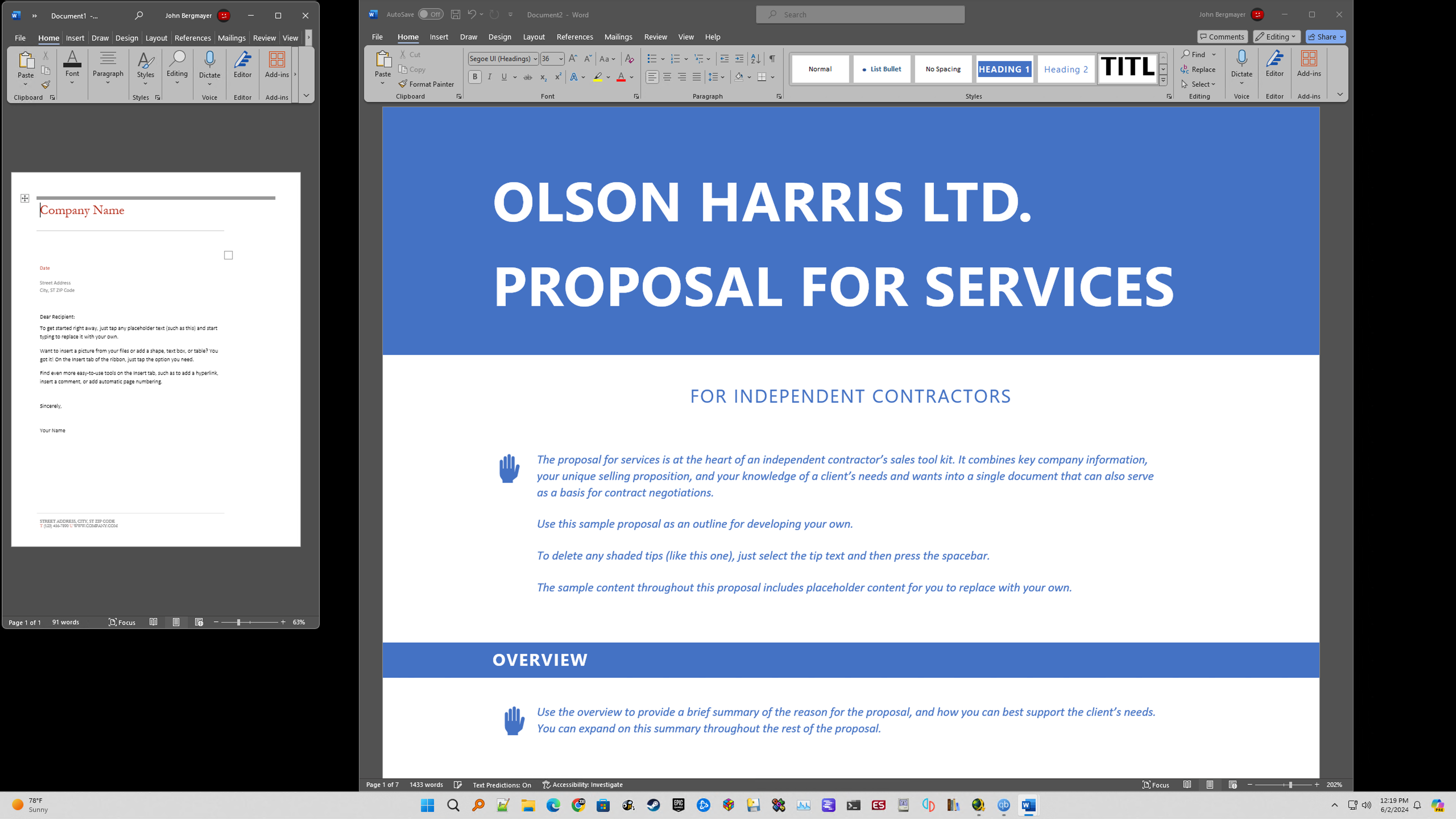 Ugly, takes up space, not an improvement, and pushes most functions to an overflow menu unless the window is wide enough.
Or you might just hide the menu somewhere new, but it amounts to the same thing.
 MS Edge overflow menu
And yeah, lots of modern Mac apps–Electron apps mostly–barely use the menu bar. I don’t like this either!
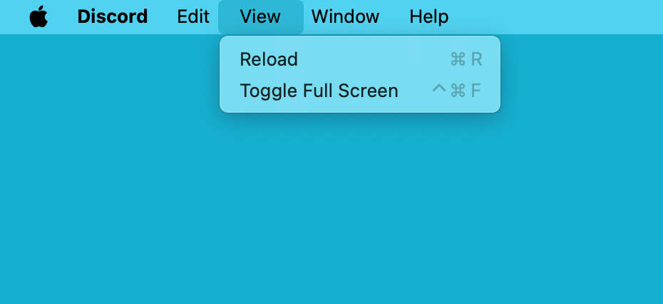 What's the point?
iPad apps have all kinds of workarounds. Sometimes toolbar buttons bring up a drop-down menu or list of options. Maybe you flip between different screens and views and there are custom controls for each function.
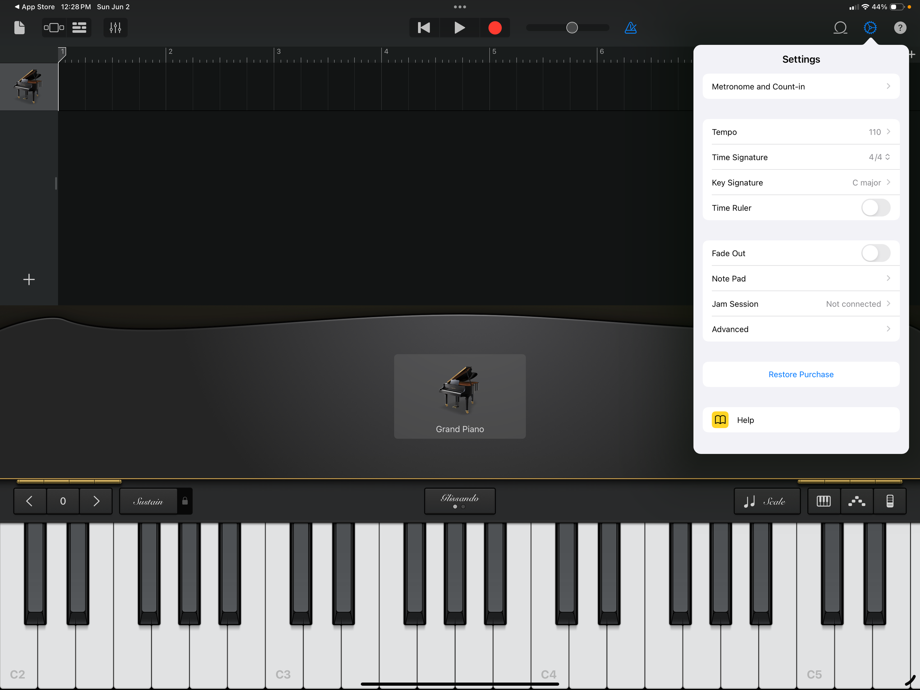 Garageband and its custom UI / use of drop-down toolbar icon
All that can be very effective, but again, we are only seeing that apps that exist. I think whole kinds of apps can’t really exist on the iPad since there is no standard way to have an app that can do all this stuff:
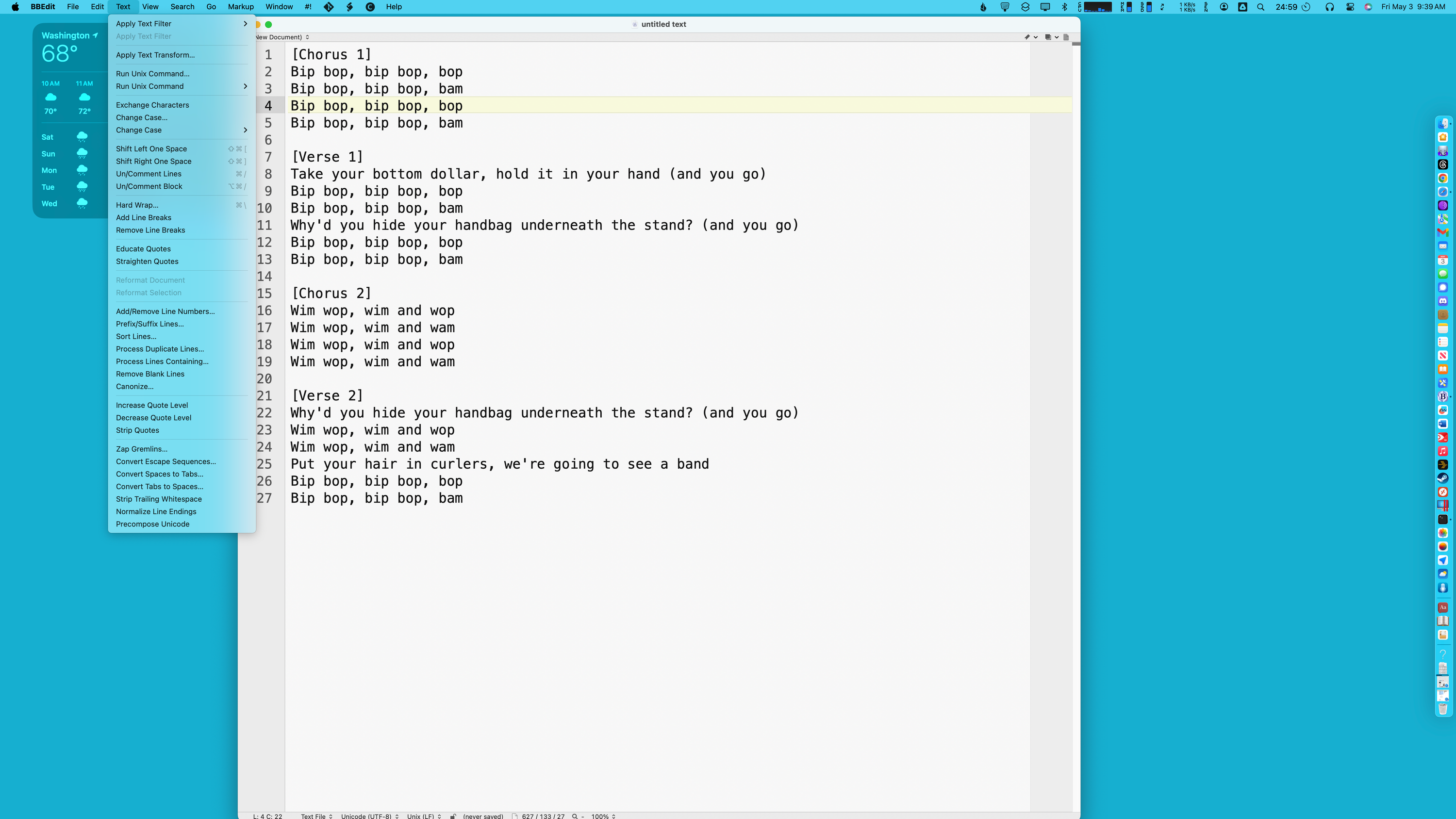 So much stuff! So few inscrutable buttons!
Even if iPadOS supported all the things that BBEdit needs to do–where the hell would you ever put all that stuff? Encrust every text document with all sorts of little mystery glyphs?
Obviously you don’t want the Mac menu bar specifically on the iPad. It’s designed for a pointer, and there should be nothing on an iPad that ever requires a physical keyboard or mouse. Without a pointer, Fitt’s law is less of an issue, though a menu bar alternative that was not attached to a specific window, Mac-style, would be superior for working with multi-window apps. I am not going to “mock something up” and my ideas for how to implement some menu bar equivalent are sure to be terrible. Anything that is browsable and discoverable, is text-based and doesn’t require piles of mystery meat glyphs and icons to be all cluttered up everywhere, and consistent from one app to another, is fine.
Back to Word: You can use the Windows version with touch, so the ribbon must be kind of usable that way. I am sure there are things that Microsoft could do, if it saw the iPad as a peer platform to Windows or Mac and not as a blown-up phone platform. I think the ribbon sucks but it does at least provide necessary features. But I doubt, that even if the design time was worth it, that you could cram an entire BBEdit’s worth of features into a glorified toolbar. Pro apps need menus! The iPad needs menus. Give us menus.
First, unlike other operating systems, the menu bar is global, at the top of the screen, and not attached to a particular window. This makes it more straightforward to deal with multi-window apps, makes it clearer that a window is conceptually something that an app spawns but is not its direct proxy (so you can easily close all an app’s windows without closing the app itself, but still be able to switch to it and interact with it), and avoids wasting screen space on duplicating the menu bar on multiple windows. And of course, targets at the top of a screen are inherently easier to use with a pointer than ones that are not.↩︎